- Daily & Weekly newsletters
- Buy & download The Bulletin
- Comment on our articles
ADAM presents the story of a century, as told through design
“I’m not really sure if there is such a thing as a national design,” says Katarina Serulus, co-curator of the newest exhibition at Brussels’ Adam museum. It’s a curious way to introduce the exhibition, Panorama, which is dedicated to Belgian design from the turn of the century to the 1980s.
But it makes sense, as what follows is not an homage to one contrived “Belgian” style over another, but rather a broader look at design’s role in the local imagination and in citizens’ everyday lives.
That role, we discover, was often guided by successive governments, which could be inconsistent in their response to the form. Take Art Nouveau. Conceived in Belgium and one of the most celebrated styles of all time, it was never really promoted by the Belgian state, which favoured classical styles in public contracts.
It was introduced to – and popular with – the local public when it was used in the Congolese pavilion at the 1897 World Exhibition in Brussels, leading Art Nouveau to become known as “Congo style” art. Panorama references that link through a pair of wall hangings, which serve as an unflinching portrait of the country’s brutal role in the Congo.
Because as well as demonstrating the contemporaneous perception of design in Belgium, the exhibition uses the form to explore what was happening in society, too. And so what follows is a walk through 20th-century life.
Affordable for all
We see, during the 1920s and ’30s, Belgian designers exhibiting in Paris move from experimental avant-garde creations to more financially viable pieces, while after the Second World War, government ministers push for a design policy driven by economic factors.
The 1950s usher in an age of debate on housing culture, and we see examples of modern furniture, affordable to all social classes. The 1950s and ’60s are Belgium’s boom years in production, demonstrated in Panorama by the Tupperware boxes in gaudy colours and bright plastic furniture.
While they could pass for something in a Swedish furniture store today, they are “Ikea avant la lettre”, created by the Brussels-based factory Meurop, which sold its products in Germany, France and the Netherlands. They also attest to Belgium’s growing emergence as a European-focused nation.
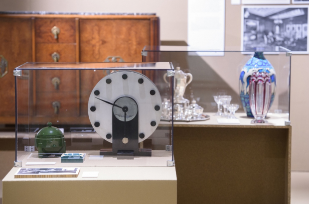
Although Panorama often focuses on the historical or social aspect of design, and the kind of pieces that might be found in a typical Belgian home, there are nevertheless nods to the country’s big names, from celebrated figures in the design world, like Victor Horta, to the royal family.
One of the exhibition’s heavy hitters, and getting its first public outing, is a jazzy blue, white and orange rug used by King Leopold III in his study. It almost didn’t make it into the show, Serulus says, until a phone call came in from the palace, informing her that the rug had been found during a chance inventory.
But Panorama also strives to highlight the contributions of less well-known names, such as Josine des Cressonnières, a woman who ensured design had a place in public policy. From the 1960s to the 1980s, she was director of Brussels’ Design Centre, an organisation that aimed to capitalise on the Belgian boom years and promote local designers as had been done in Germany, Italy and Scandinavia.
Why the metro is orange
She was also the secretary general of a prestigious design prize, the Signe D’Or. “There weren’t many women in the design world at that time… and she was a very powerful one,” says Serulus.
You can say that again. During her tenure at the Signe d’Or, she ensured that public commissions on infrastructure projects took design into account, too. “That was her ideology – to get a real design policy in Belgium,” says Serulus.
Public infrastructure design is most prominent towards the end of the show, where visitors are greeted by a large blue metro sign (“very difficult to get hold of”) and a model metro carriage, its silver metal doors and orange interior familiar still to today’s Brussels commuter. (It’s orange, we’re told, because of a public vote in which residents plumped for that colour over the blue alternative they were offered.)
Each of these details helps to create a patchwork of local society through the 20th century and are explained best by the inscription on the exhibition’s wall by renowned architecture critic Geert Bekaert. Belgian design’s key feature, he said, is the “absence of Belgian identity”.
And it is this “non-identity” – the mix of styles, policies and attitudes – that helps Panorama to encapsulate a tumultuous century.
Photo: C Licoppe


